Skip to the main content

3 projects10 platesStudio archive

Archive

Marks, palettes and the applications they were tested on, shown as the artwork itself.

Images show the work. Still Measure also includes a short account of its design challenge and choices; no outcomes are claimed.
The one case study with figures

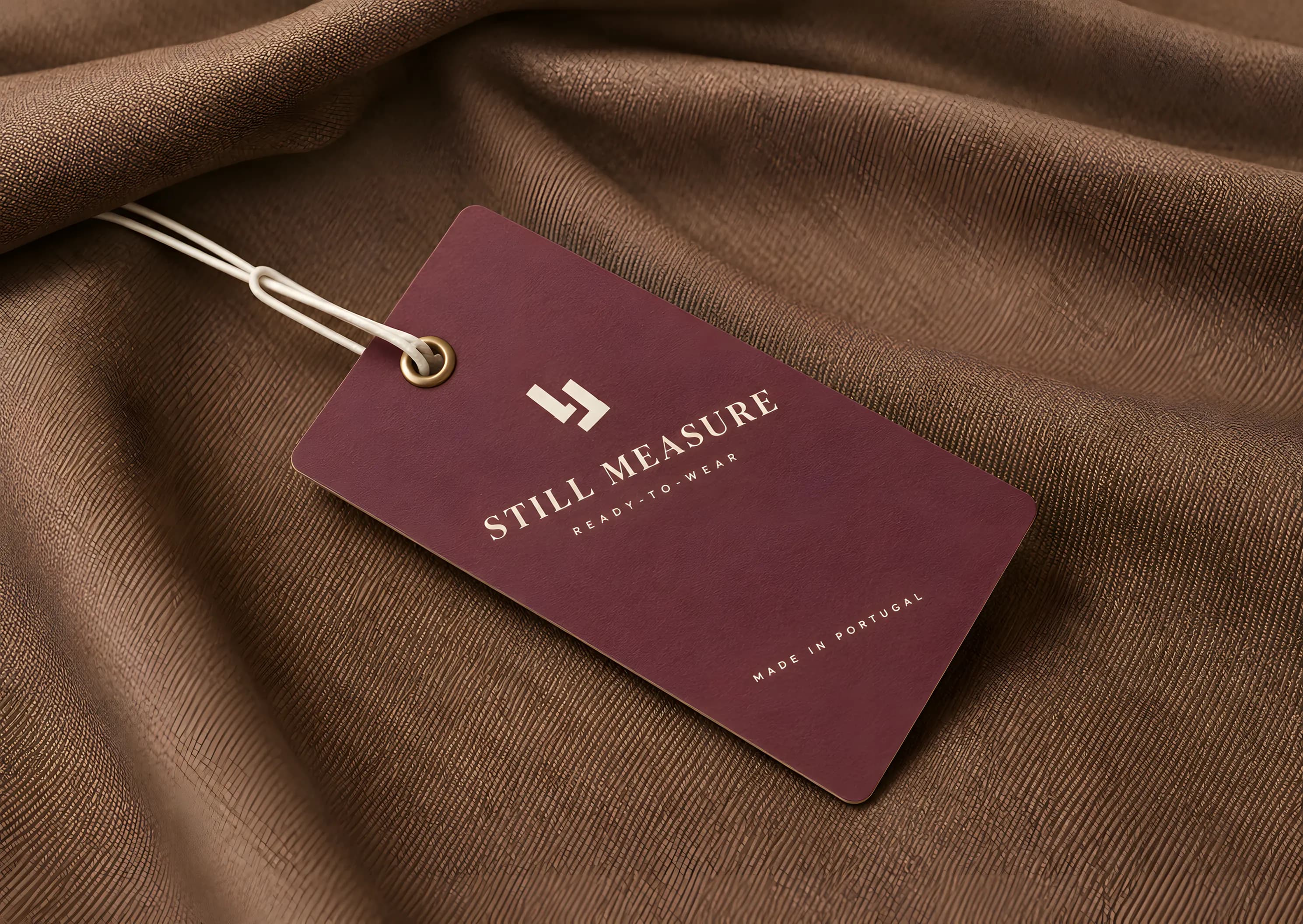
A photographic mockup: a rigid mulberry-wine hang tag with a brass eyelet and an oyster cord, lying diagonally across folded tobacco-brown wool suiting. It carries the two-L mark, STILL MEASURE, the line READY-TO-WEAR and, at its foot, MADE IN PORTUGAL, all in oyster white.
Still Measure · Hang tag · Anonymised

Images show the work. Still Measure also includes a short account of its design challenge and choices; no outcomes are claimed.

How we test a mark

Strategy, identity and digital presence as one job. Every identity here was drawn against the worst place it will be reproduced, before it was signed off.

  • A mark drawn with no small parts, tested at hang-tag size and at fascia size from the same artwork.
  • A type pairing with a stated job for each face, rather than two fonts that happen to look nice together.
  • Colour with measured contrast ratios, and a stated job for every colour in the palette.
  • A usage guide covering the rules that actually get broken: clear space, minimum size, grounds, and the ones that are never allowed.

Still Measure

A real, paid identity for a small womenswear label, published under an agreed anonymised name. At the client's request, the mark, palette, copy and applications shown here were re-drawn from the brief. These plates document design work, not a measured business outcome.

AnonymisedClient work, anonymisedClient work, anonymisedNo metrics claimed

Client work, anonymised — name, brand and applications re-drawn at the client's request.

The challenge
The applications show the design challenge: keeping one identity legible from a small garment tag to a shopfront.
The decision
Pair the interlocking two-L mark with a wedge-serif wordmark, then carry the mulberry and oyster palette across tags, bags, a lookbook and retail displays.
Why it helps
The system gives the label a consistent identity across small-format packaging and larger shop applications. These publication redraws do not establish in-market recognition or sales.

Need an identity that carries from a small label to a full storefront?

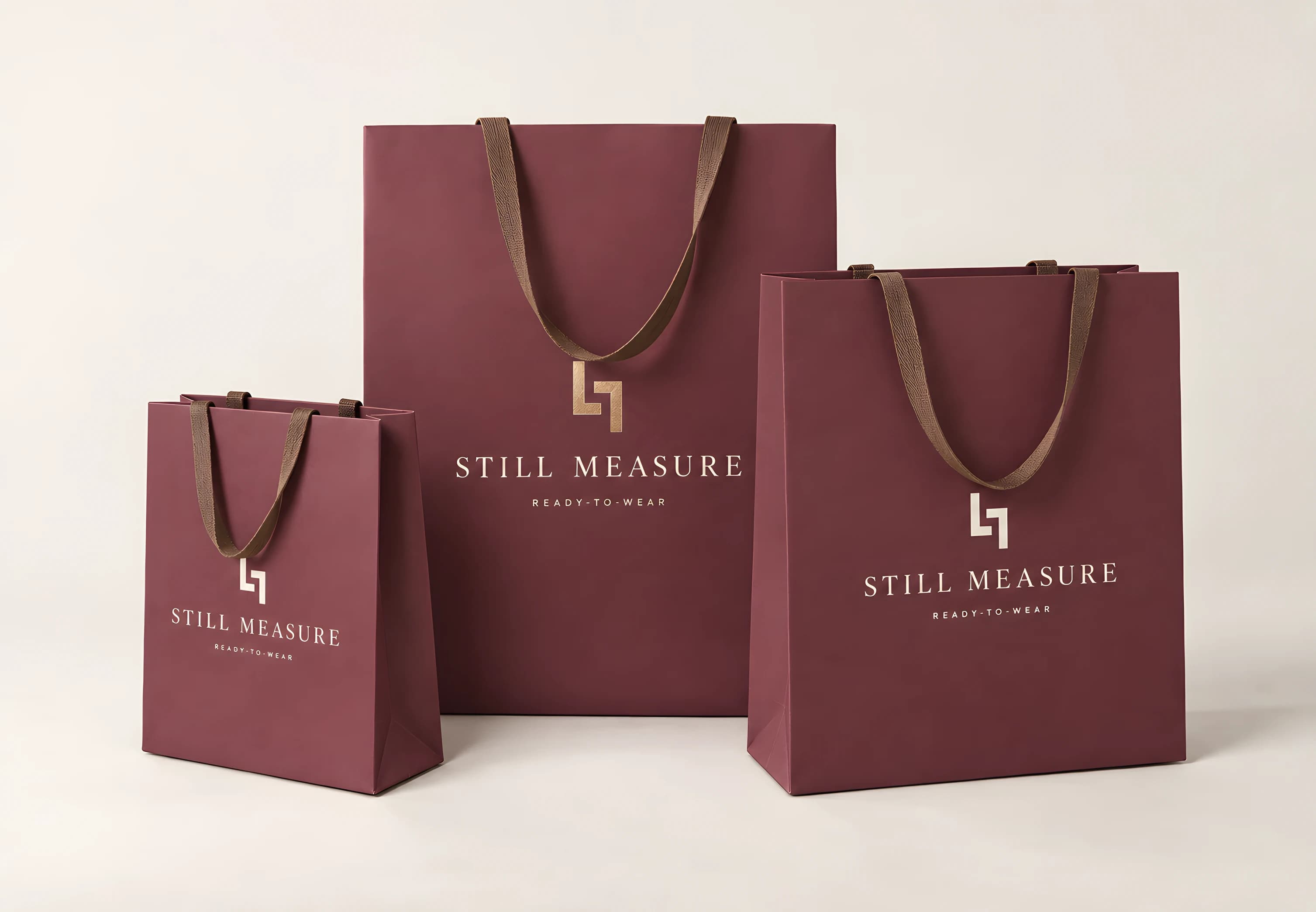
Three mulberry-wine paper shopping bags of three sizes on an oyster studio sweep, with tobacco-brown ribbon handles, each carrying the two-L mark above STILL MEASURE and READY-TO-WEAR.
Still Measure · retail brand · client work, anonymised
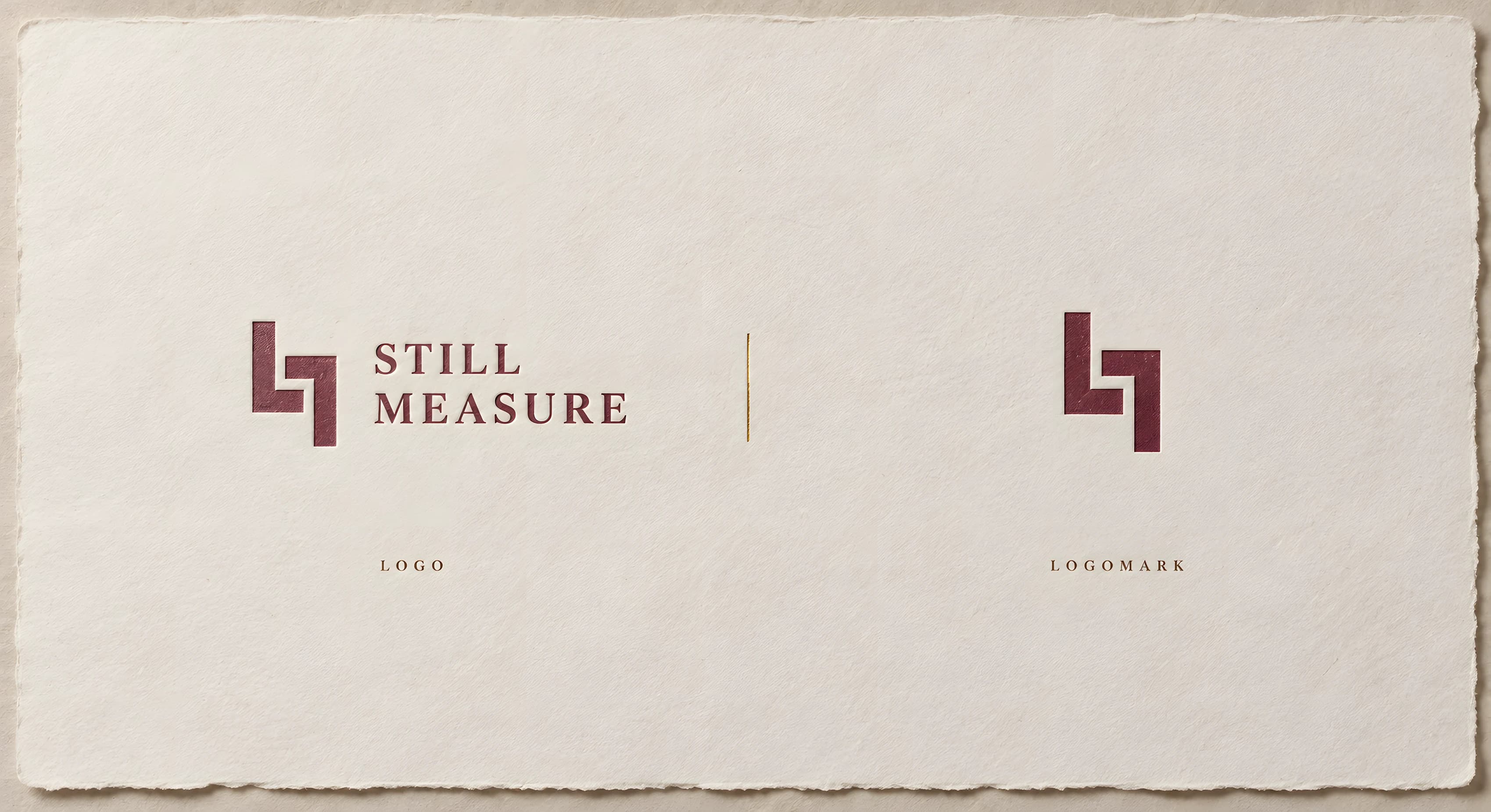
A photographed letterpress sheet on heavyweight deckle-edged oyster paper: on the left the logo — a mark of two interlocking mulberry L forms beside STILL MEASURE set on two lines in wedge-serif capitals — captioned LOGO; a short gold foil hairline at the centre; on the right the mark alone, captioned LOGOMARK.
SP-27Logo and logomarkAnonymised
A photographic mockup: a rigid mulberry-wine hang tag with a brass eyelet and an oyster cord, lying diagonally across folded tobacco-brown wool suiting. It carries the two-L mark, STILL MEASURE, the line READY-TO-WEAR and, at its foot, MADE IN PORTUGAL, all in oyster white.
SP-28Hang tagAnonymised
Three mulberry-wine paper shopping bags of three sizes on an oyster studio sweep, with flat tobacco-brown ribbon handles. Each front panel carries the two-L mark above STILL MEASURE and READY-TO-WEAR — the mark in champagne gold foil on the tallest bag and in oyster white on the two smaller ones.
SP-29Packaging, three sizesAnonymised
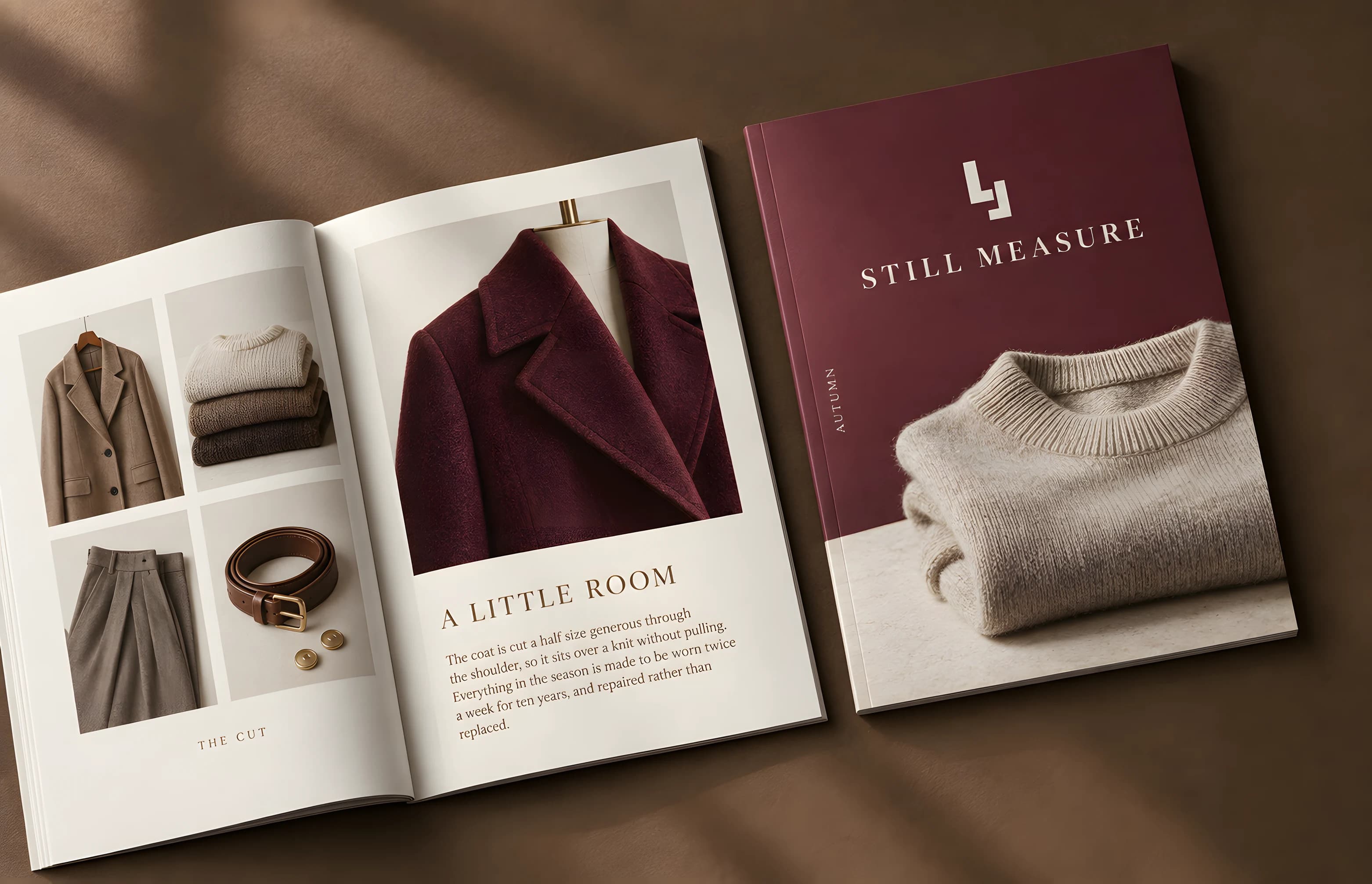
Two lookbooks photographed from above on a tobacco-brown surface with a soft blind shadow across them. The closed cover is a mulberry field with the mark and wordmark above a photograph of a folded oatmeal knit, with AUTUMN set vertically at its edge. The open spread carries a four-up grid of garment still lifes captioned THE CUT, and a large photograph of a mulberry coat on a stand form cropped at the shoulder, headed A LITTLE ROOM.
SP-30LookbookAnonymised
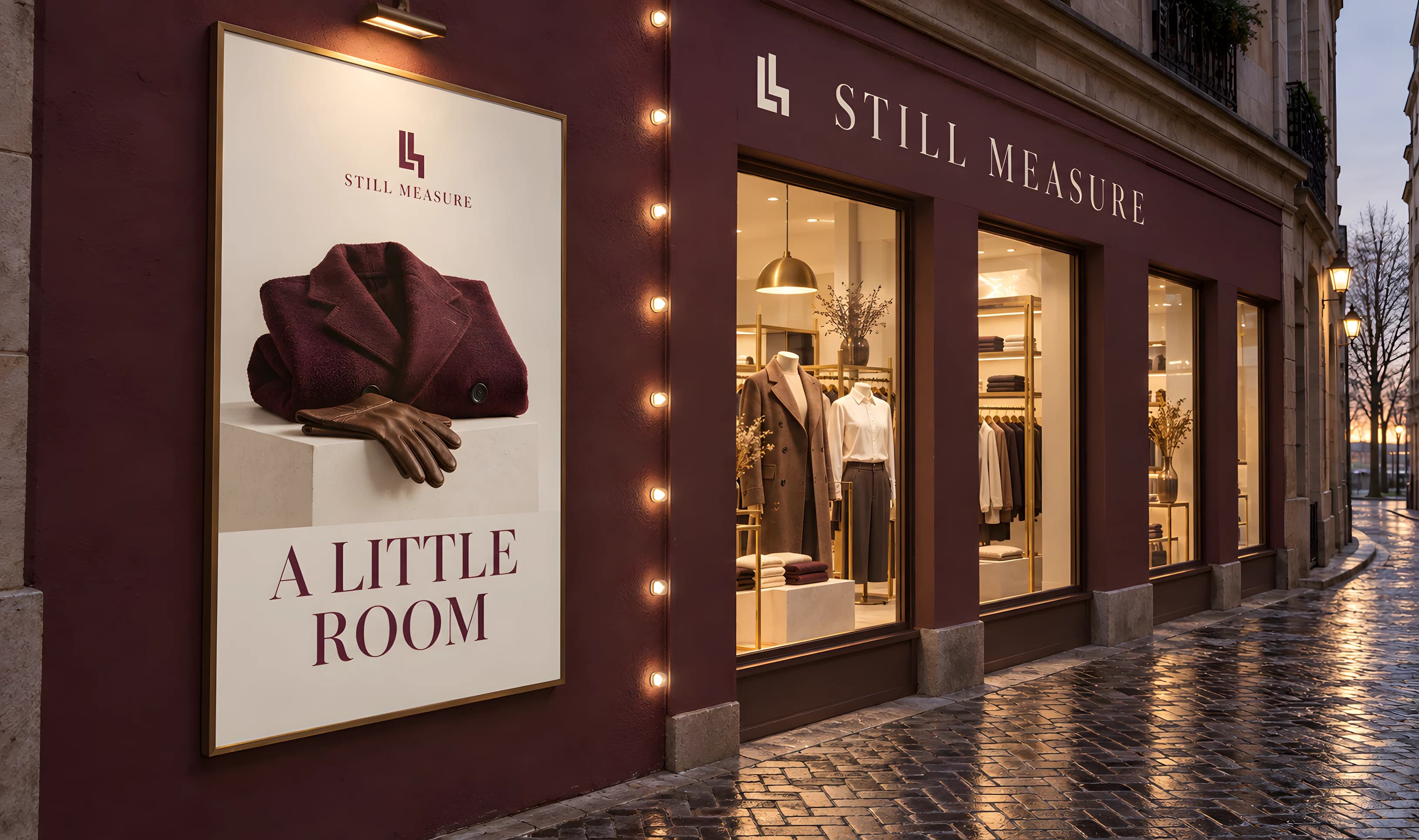
A mulberry-wine shopfront photographed at blue hour on a wet granite-sett lane, STILL MEASURE set across the fascia in oyster capitals beside the two-L mark. A framed window poster on the near wall shows a folded mulberry coat and tobacco gloves on a plinth under the line A LITTLE ROOM; warm light spills from the glazing, where headless dress forms and brass rails are visible.
SP-31ShopfrontAnonymised
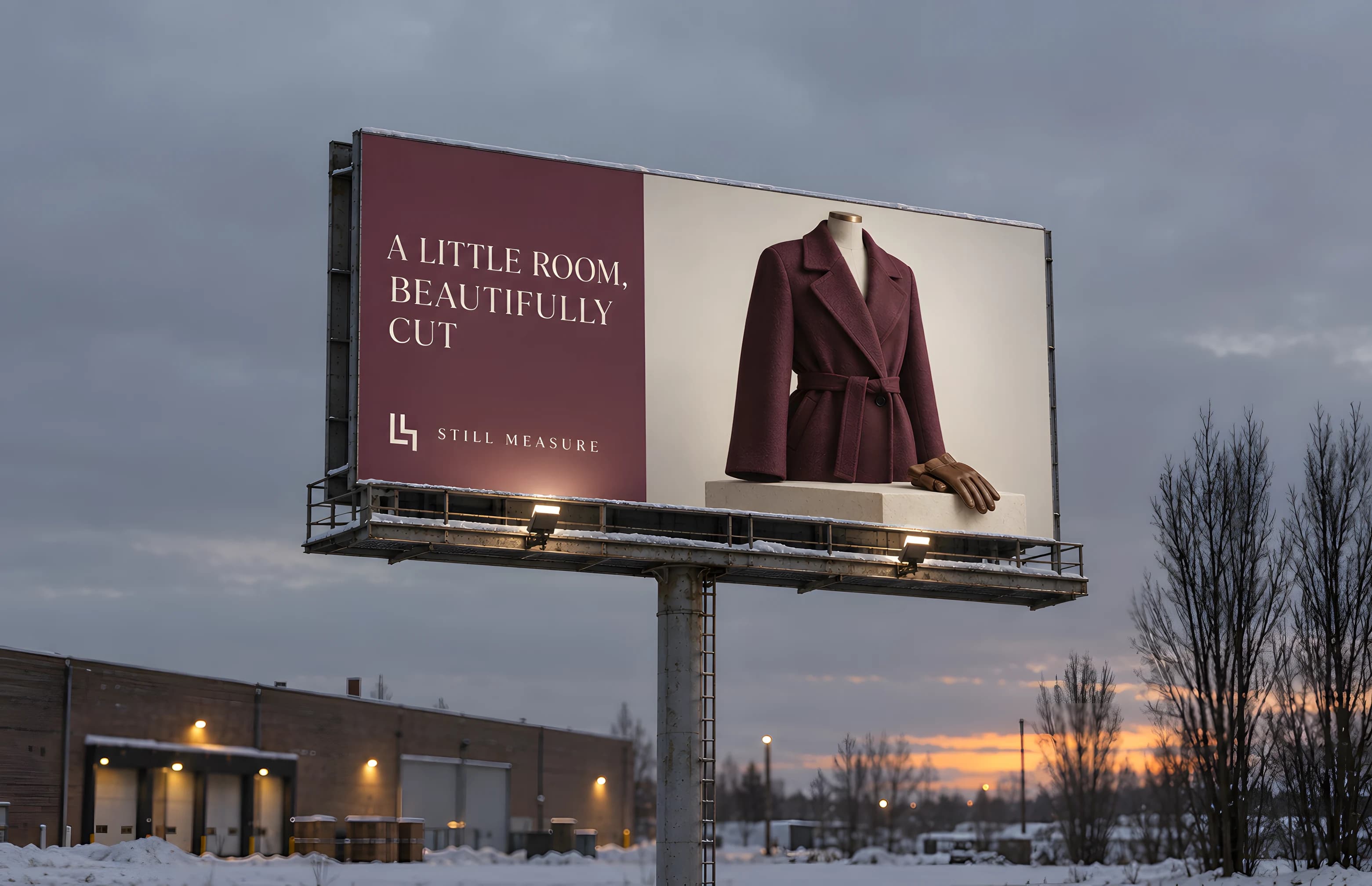
A roadside billboard at winter dusk over snow-dusted ground, a brick warehouse and bare poplars behind it. Its mulberry left third reads A LITTLE ROOM, BEAUTIFULLY CUT in oyster capitals above the mark and wordmark; the right two thirds show a mulberry wool coat on a tailor's stand form, cropped at the shoulder, with a leather glove on the plinth.
SP-32BillboardAnonymised

Anarchy

Anarchy is the invented clothing brand behind the fashion e-commerce breakdown, and this is its identity: one olive-yellow disc, a black wordmark with a registered mark, and Articulat CF as the single face. It exists so the store concept had a real brand to be designed for, rather than grey boxes. There is no client and no metric attached to it. The store pages themselves, and the projection they carry, are set out in the breakdown.

Studio workDesign workStudio archiveNo metrics claimed

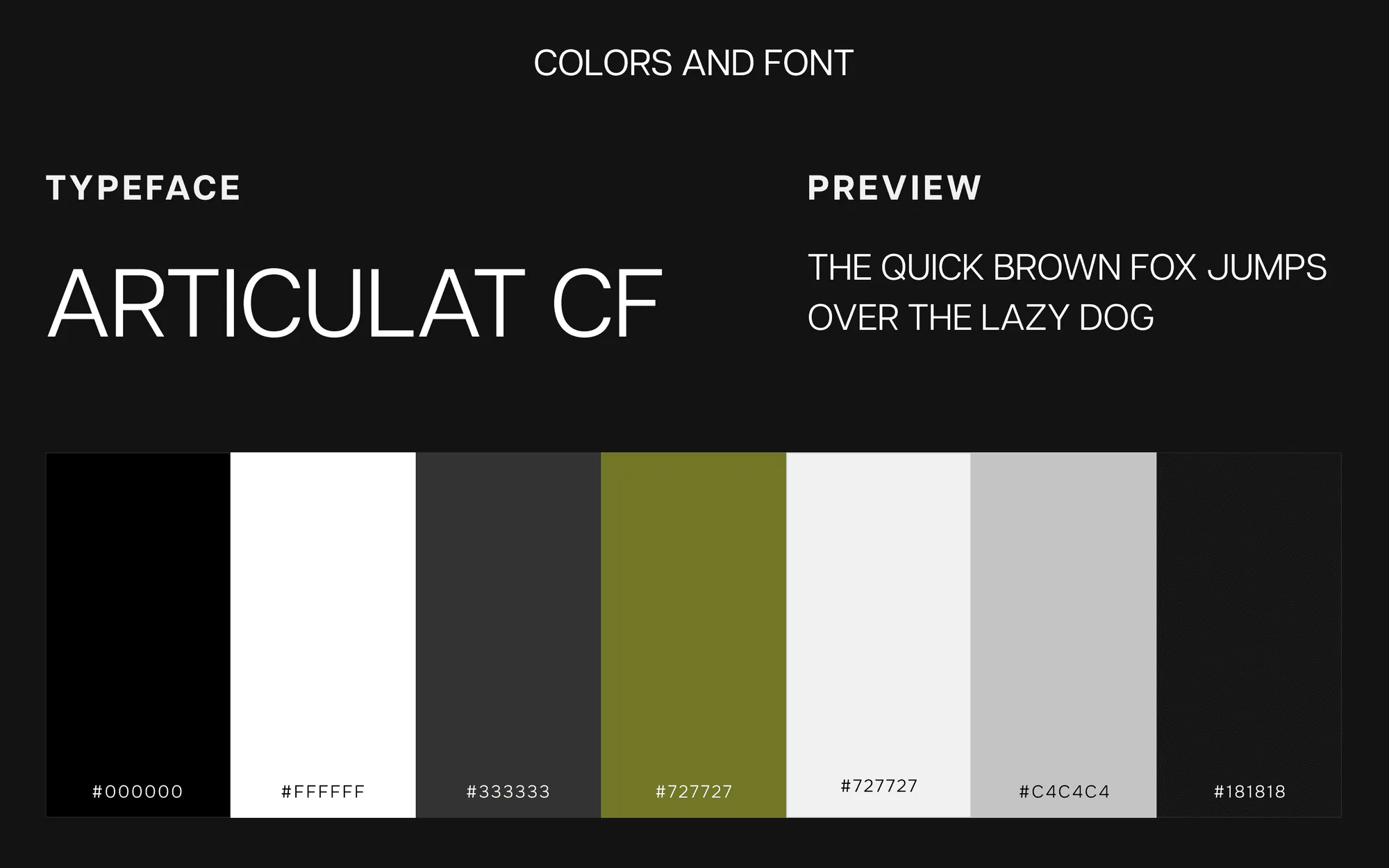
A dark slide headed COLORS AND FONT: the typeface Articulat CF with a preview line of capitals, above a row of six swatches labelled with their hex values in blacks, whites, greys and olive.
SP-39Palette and typeStudio archive
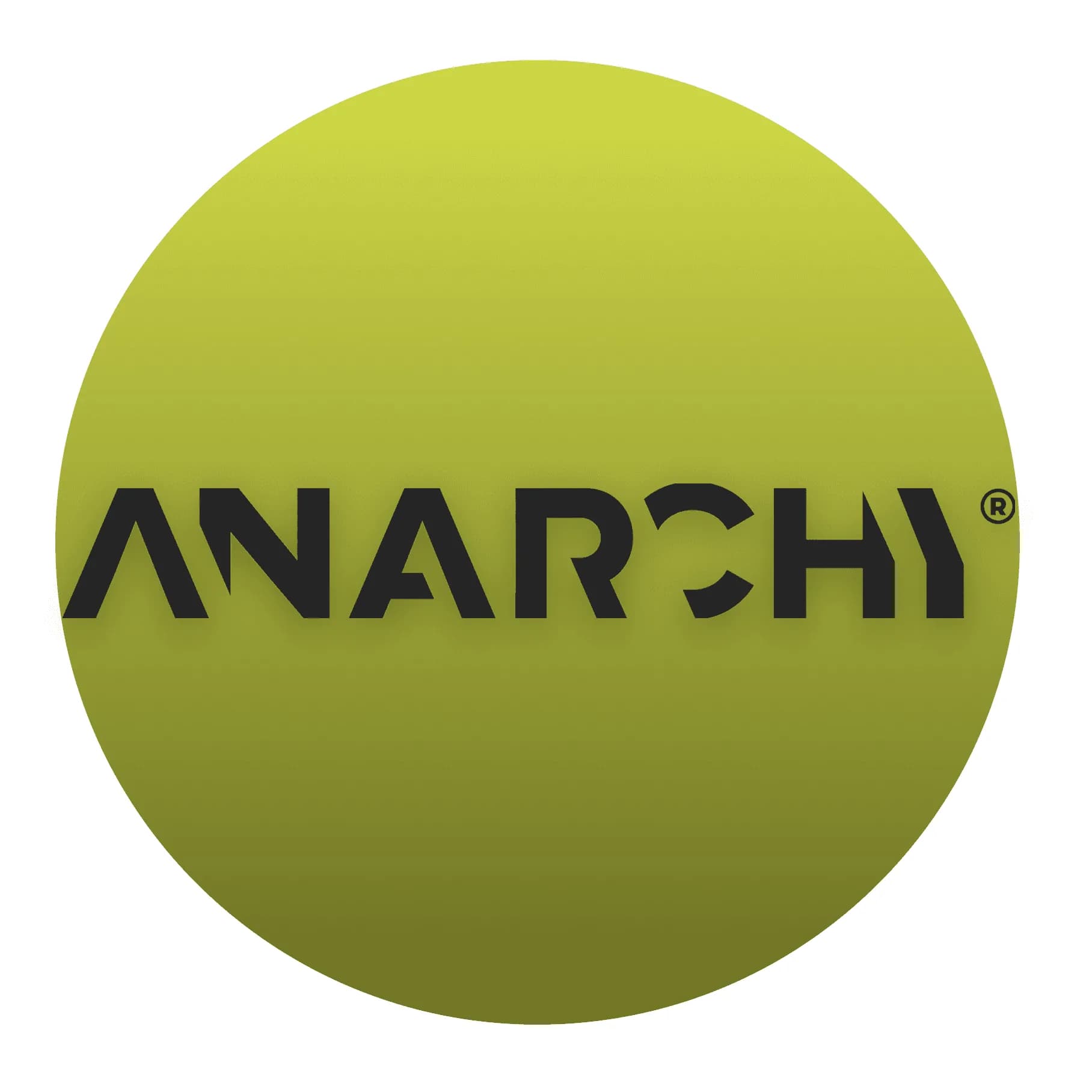
A large olive-yellow circle on a slate-grey square, with the black ANARCHY wordmark and a registered mark across it.
SP-40LogoStudio archive

Cuddle Cove

Cuddle Cove is a second childcare concept, drawn alongside the Wonderhill breakdown to test the same structure in a different voice. The mark is a whale and a wave with the line “where comfort meets care”, and the palette moves from Wonderhill's green to a light blue and pink. The plates show the landing page and the applications. No centre commissioned it and nothing has been measured, so no figure is attached.

Studio workDesign workStudio archiveNo metrics claimed

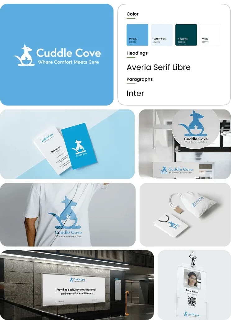
The Cuddle Cove brand board: the logo in light blue with a whale and wave mark and the line where comfort meets care, colour chips, a type specimen pairing Averia Serif Libre with Inter, and mockups on a t-shirt, a mug, a tote, signage and print.
SP-41Identity and applicationsPresentation board
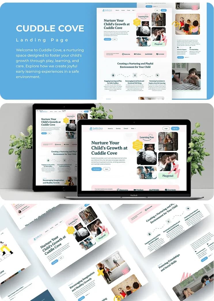
The Cuddle Cove landing page board: a full-page render of the pink-accented childcare site beside a laptop and tablet mockup and a set of tilted page screens.
SP-42Landing page conceptPresentation board

Need a mark that reads at twenty pixels and on a van door?

We draw the mark, set the type, state the colours with their contrast ratios, and write the guide so the identity survives the first person who is handed it.

Or send us the site you have. Request a Redline

That is the work. What it costs is published, before any call.

Read the published prices