That is the work. What it costs is published, before any call.
Make a travel brand readable at a glance.
A budget-travel identity designed for buses, vans and station posters, with a clear role for each colour and application. The name, mark, palette and applications shown here are re-drawn at the client's request.
- The challenge
- A budget-travel identity had to earn attention across a platform, through a car window and on a bus without making a low fare feel like a low-quality brand.
- The decision
- Use a compact half-dome mark, three colours with stated jobs and short lines, then draw each application for its real viewing distance and surface.
- Why it helps
- The system is designed to carry the same identity from a quick transit glance to a closer read on stationery. The applications are drawings, and recognition has not been measured.
- Our role
- Brand identity, the mark, the colour and verbal systems, applications
- Scope
- Wordmark and mark, a three-colour system, stationery, van and bus livery, transit and roadside boards
- Constraint
- Read from a moving car; the brand re-drawn for this page
- Disciplines
- Branding and identity
- Year
- 2024
- Status
- Client work, anonymised
Three decisions, on the surfaces they were made for
Images first. Every application is a drawing of intended placement; every fare and address on them is sample copy.
Decision 1: Three colours with their jobs stated — golden yellow as the recognition field, dark cocoa for all type and the mark, warm porcelain as the reading surface — plus stone as a neutral for photography and secondary panels.
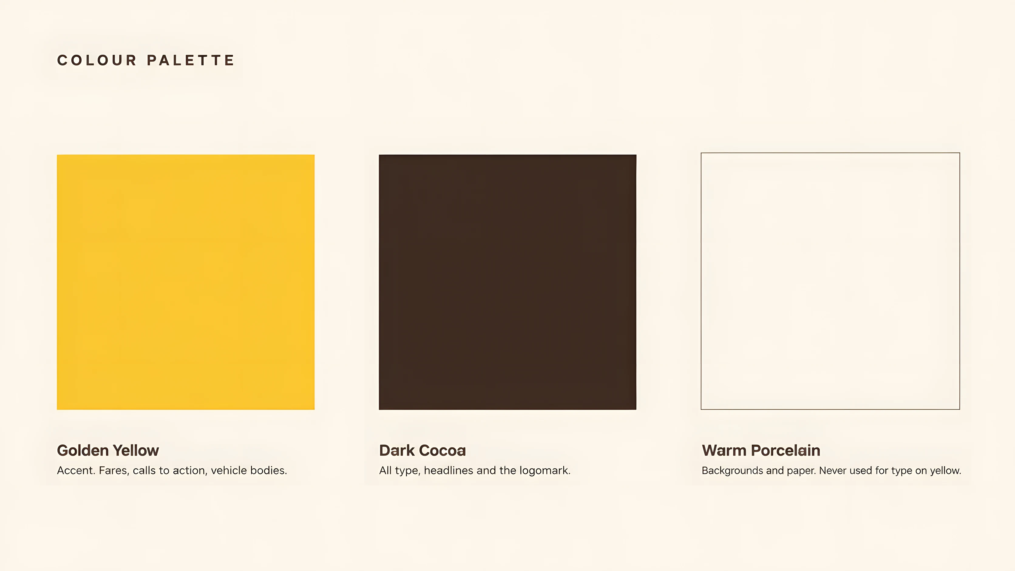
SP-34Palette, with each colour's job Decision 2: A verbal system of short imperatives: Go further on less. Your map gets bigger. Every city is closer. None of them implies a verified fare or a guarantee.
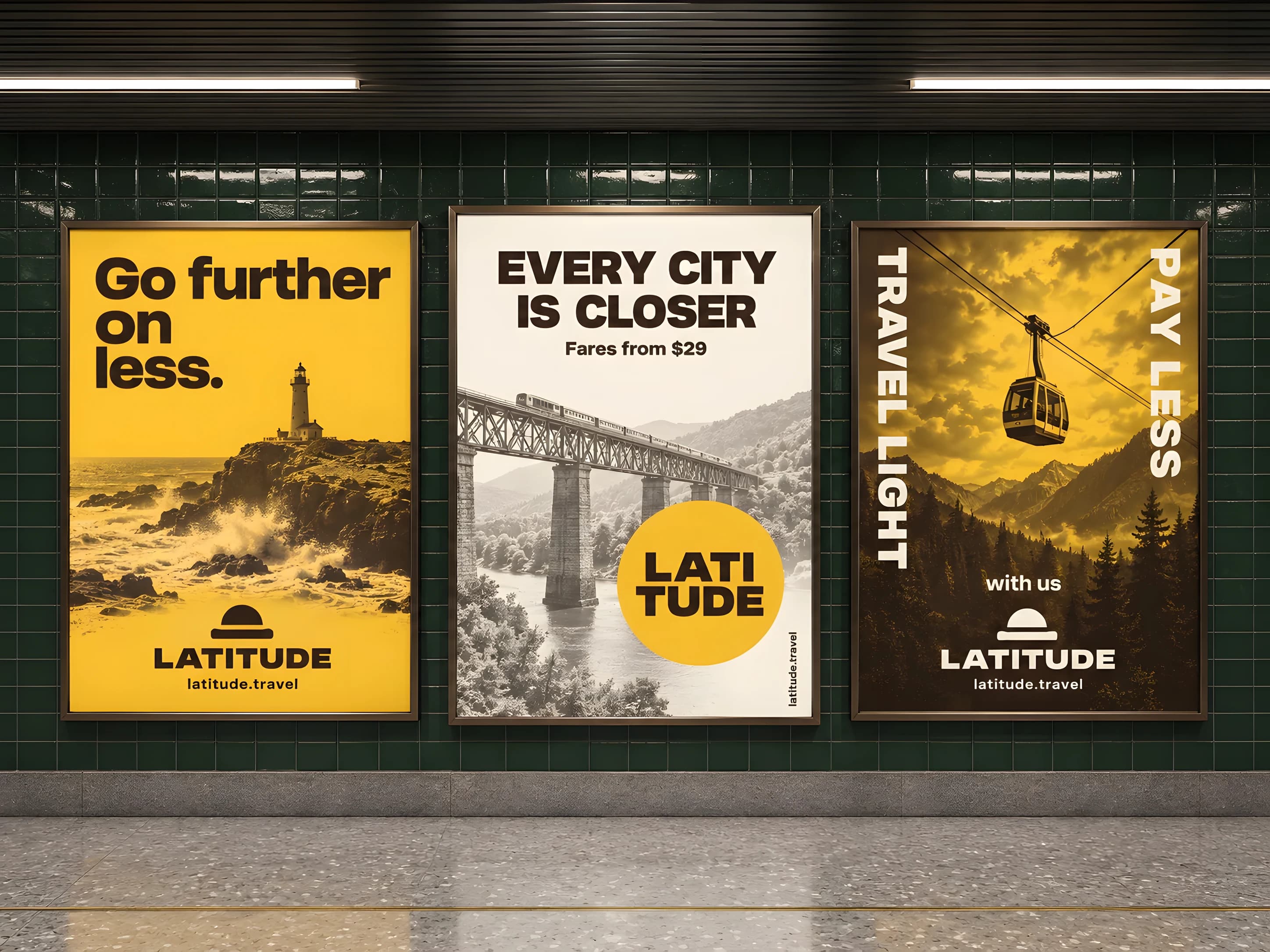
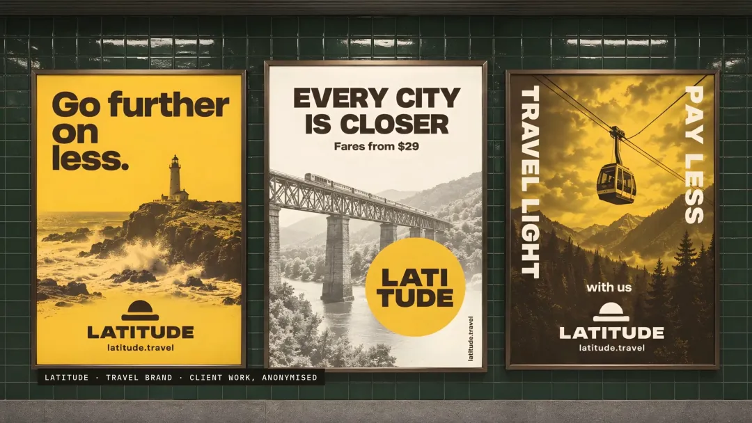
SP-38Transit triptych Decision 3: Stationery that tests what happens when the glance becomes a read: colour at the edge, white space reserved for correspondence, and recognition separated from contact details across the two card faces.
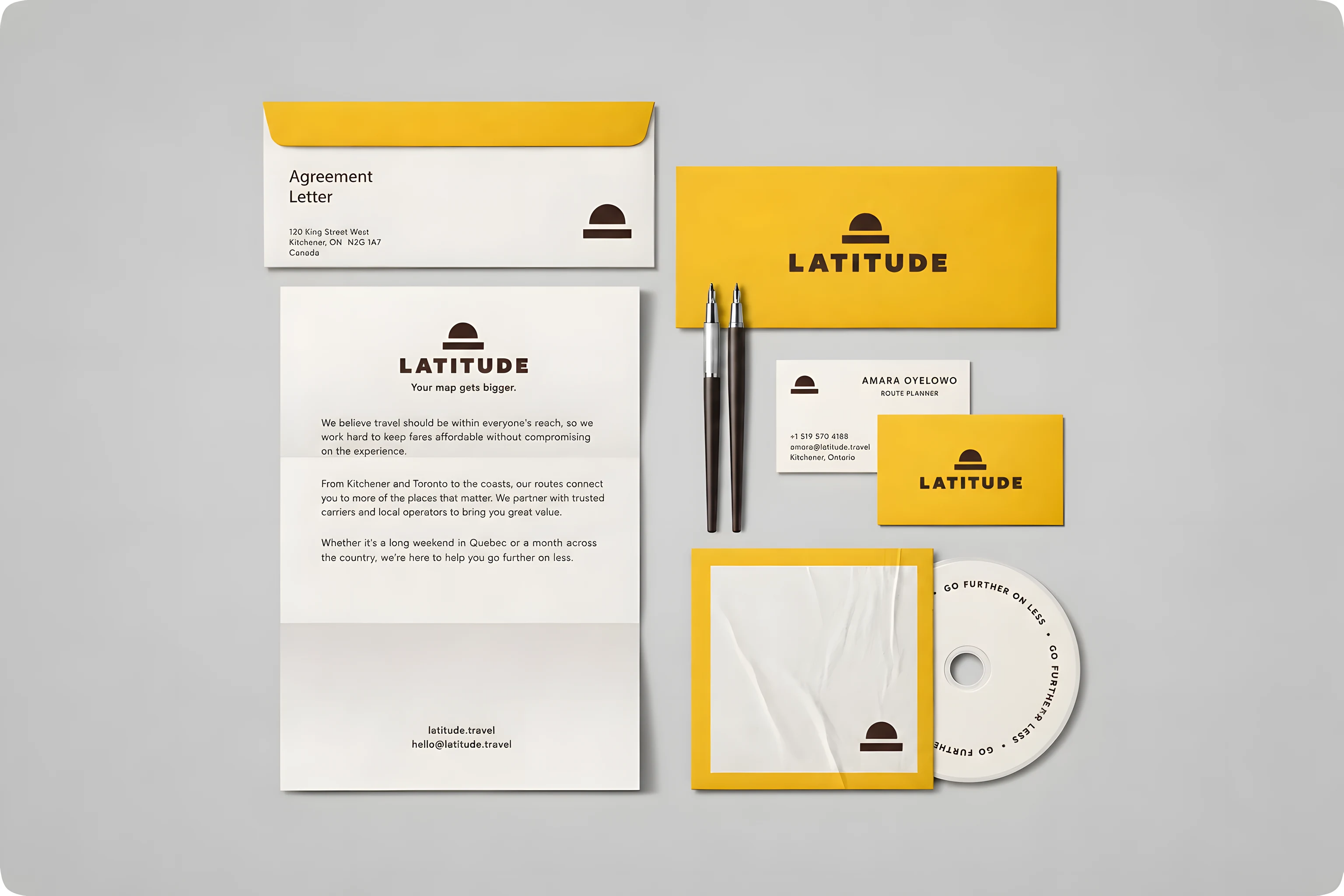
SP-35Stationery
Also in the build
- A mark with no small parts: a half-dome over a solid bar, six shapes on one grid, usable beside the wordmark or alone once the name is established.
- A wordmark in heavy extended capitals, supplied as outlines so it does not depend on an installed font.
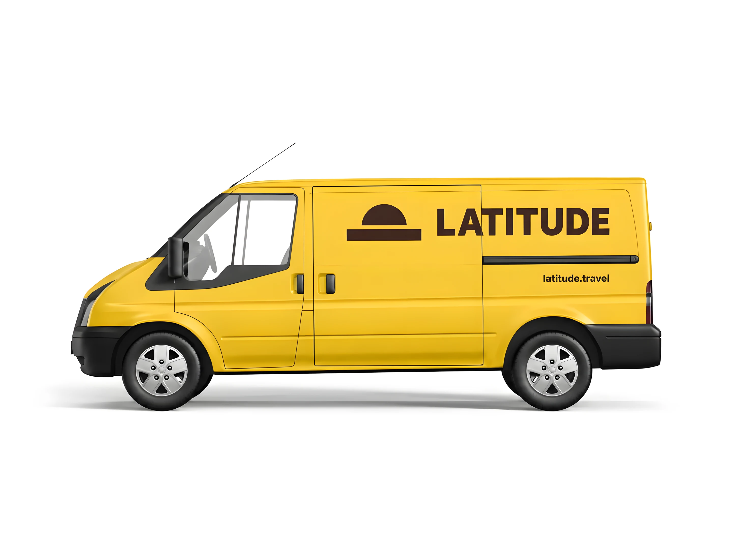
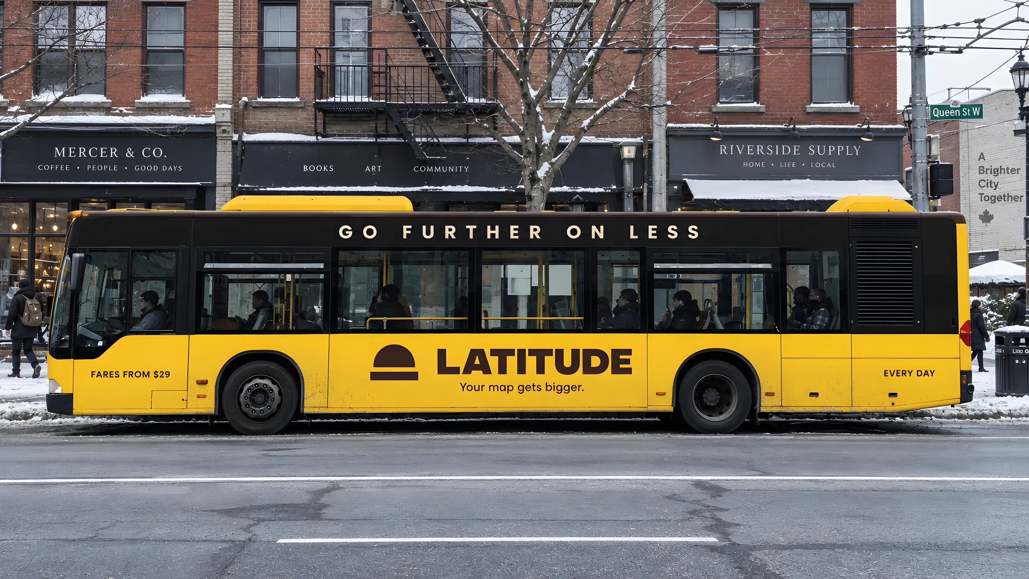
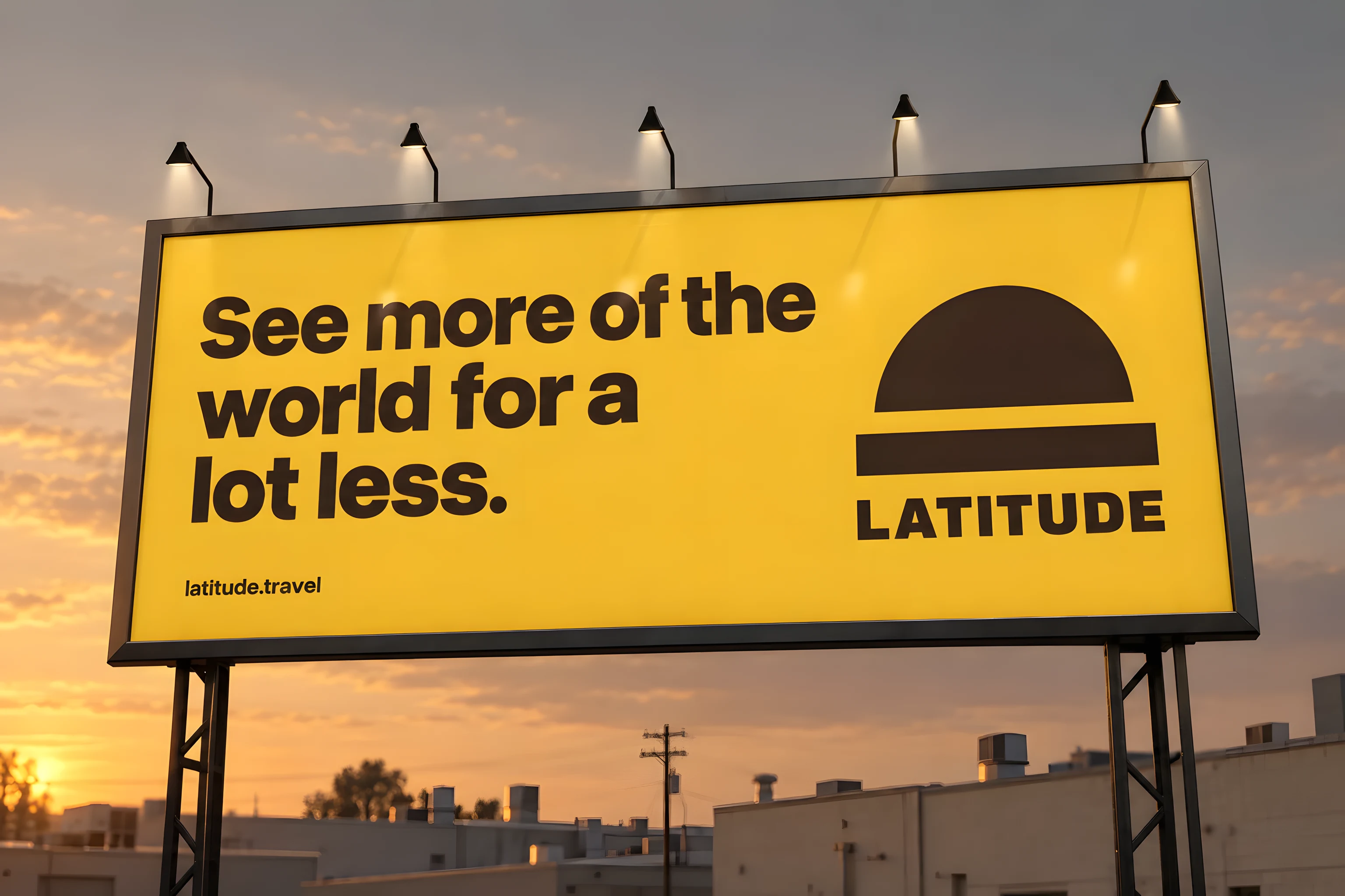
- Vehicle and out-of-home drawings sized to their surfaces: van cargo panel, bus below the glazing, a three-poster transit run, and a roadside board reduced to name, invitation and descriptor.
The plates
More of the work. Each caption says what it shows and when it was captured.
Limits- Real, paid work, re-drawn at the client’s request.
- No figures: the numbers are the client’s.
- No artwork the client owns is shown.
What was checked
- What can be checked is the construction. The mark is a half-dome over a solid bar — a sun on a horizon — with six solid shapes on one grid, no initial, no punctuation and no fine internal stroke to disappear at distance or in motion.
- The colour system states each colour's job rather than its mood, which is the part of a brand guide that gets used: golden yellow is the recognition field, dark cocoa carries every piece of type and the mark itself, and warm porcelain is the reading surface. Cocoa on yellow is a firm, high-contrast pairing at poster scale.
- The applications were drawn to the constraints of their surfaces: the van uses the uninterrupted cargo panel, the bus keeps its identity below the glazing so windows, doors, lights and wheel arches stay functional, and the transit triptych repeats the margin and the brand position while varying the scale of the mark.
The limits of that
- The engagement was real and paid for. The client asked not to be showcased, so the name, the brand and the interface on this page were re-drawn by us: the decisions are the project's, the artwork is not the client's. Nothing here is a figure, because their numbers are theirs.
- Contrast was calculated on screen. It is not a measurement of legibility at speed, in rain or at night.
- No minimum size has been set for the full lockup, and the standalone mark has a provisional floor of 32 pixels; below 24 the bar and the dome start to merge.
- The colour values are screen values. Print needs a proof on the chosen stock, and vehicle work needs measured templates and the operator's approval.
- Anonymisation is not a guarantee. Someone who worked on the original commission may still recognise its scope.
What we did not do
- We did not keep the client's identity. The name, the mark, the palette, the lettering, the campaign lines and every application drawing on this page were made for the anonymisation, and the client's own artwork appears nowhere on this site.
- We did not claim field-tested recognition. Nobody has stood at a bus stop with a stopwatch, so the legibility work here is a design argument, not a measurement.
- We did not claim a business outcome. We hold no traffic, booking or revenue figures, so none appear.
- We did not invent a fare. Every price on a poster or a panel here is sample copy, and no discount, guarantee or route is being offered by anyone.
- We did not photograph installed work. Every application is a drawing of intended placement, not a photograph of something built.
Building a brand that has to be read fast?
We design identities for the surfaces they actually live on, and we state each colour's job so the guide gets used. If you would rather we never showed it, that is a normal request and this page is what it looks like.