That is the work. What it costs is published, before any call.
Put the next study session on the first screen.
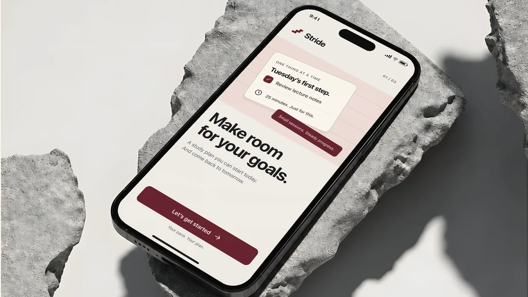
Product design for a study-habit iOS app, from onboarding to the daily plan. The flows, information architecture and component logic come from the paid engagement; the identity is re-drawn at the client's request.
- The challenge
- A task list shows what is unfinished; it does not tell a student what to do in the next twenty minutes.
- The decision
- Put one named, scoped and timed study session first, then make onboarding and study areas support that next step.
- Why it helps
- The design gives an open-ended study intention a concrete next action. Nobody outside the studio tested the screens, and no product outcome is claimed.
- Our role
- Product UX and UI, the screen set and the component library
- Scope
- Onboarding, intake, study areas, the daily plan and task creation
- Constraint
- Phone-first, iOS; the identity re-drawn for this page
- Disciplines
- Product UX and UI, Branding and identity
- Year
- 2025
- Status
- Client work, anonymised
Three decisions, and why
Three of the decisions, and the screens they were made on.
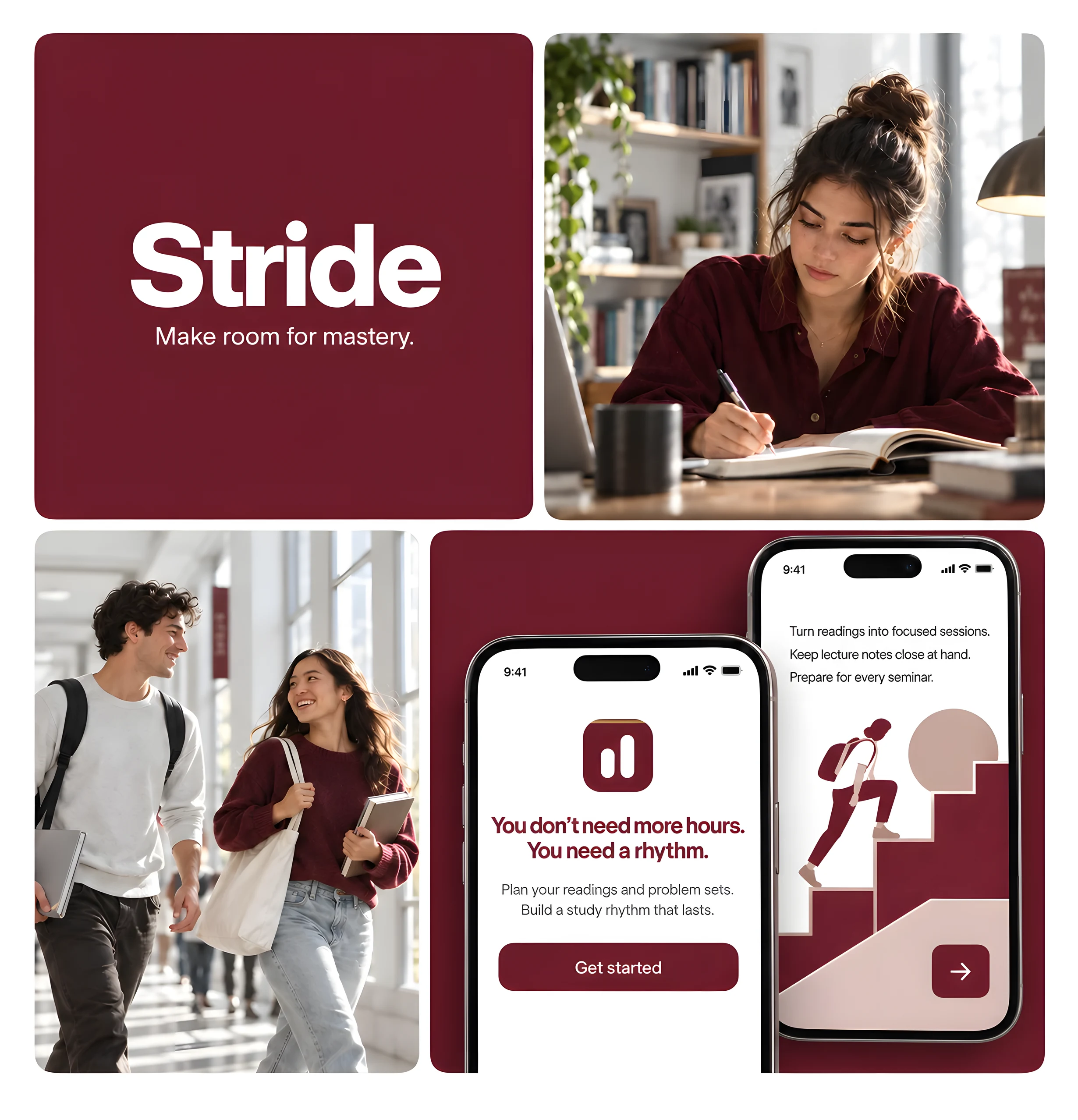
Decision 1: Onboarding in three screens and under thirty seconds: what the product does, then how much study time actually fits the day, with copy that says out loud the choice can change.
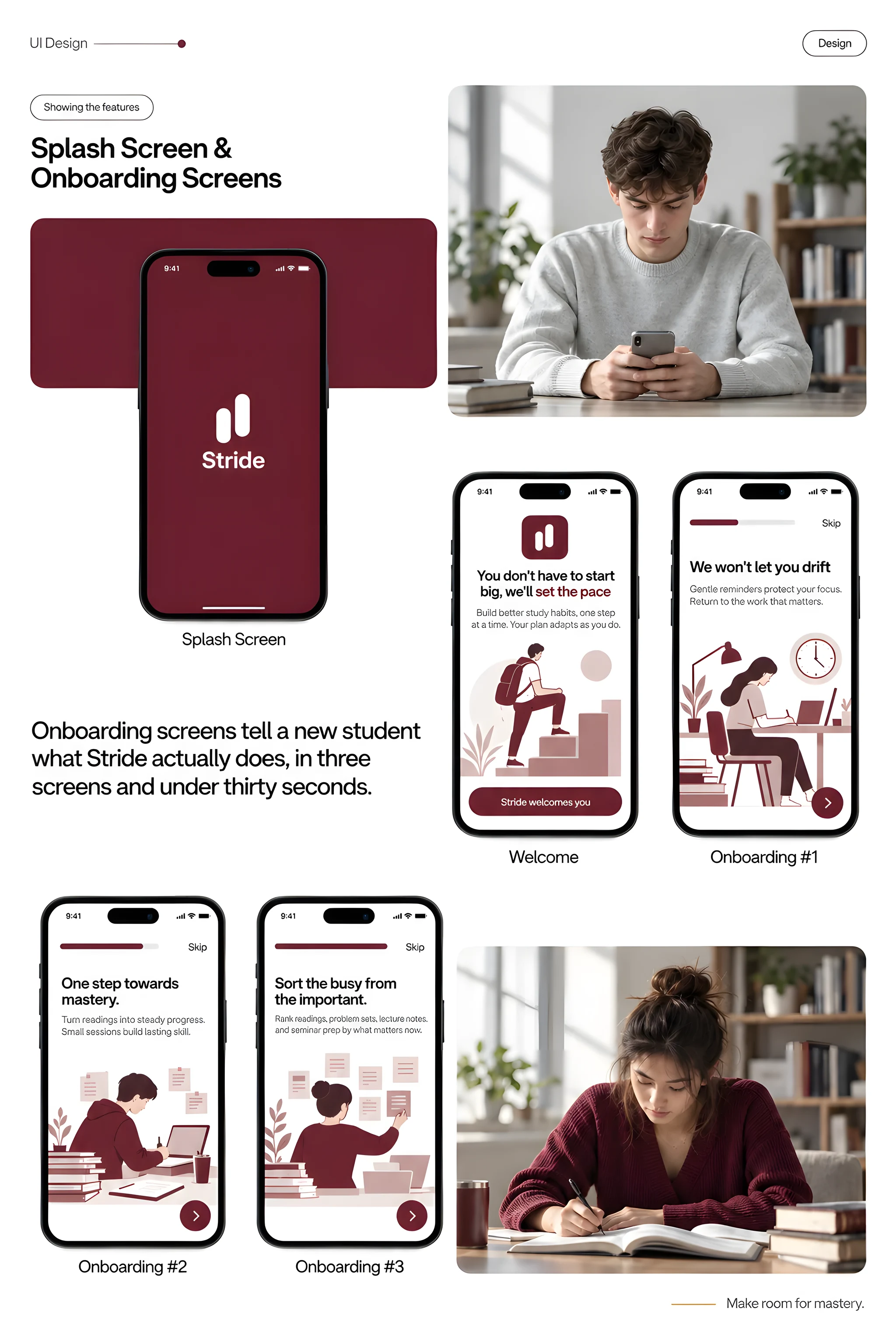
SP-22Splash and onboardingPresentation board 
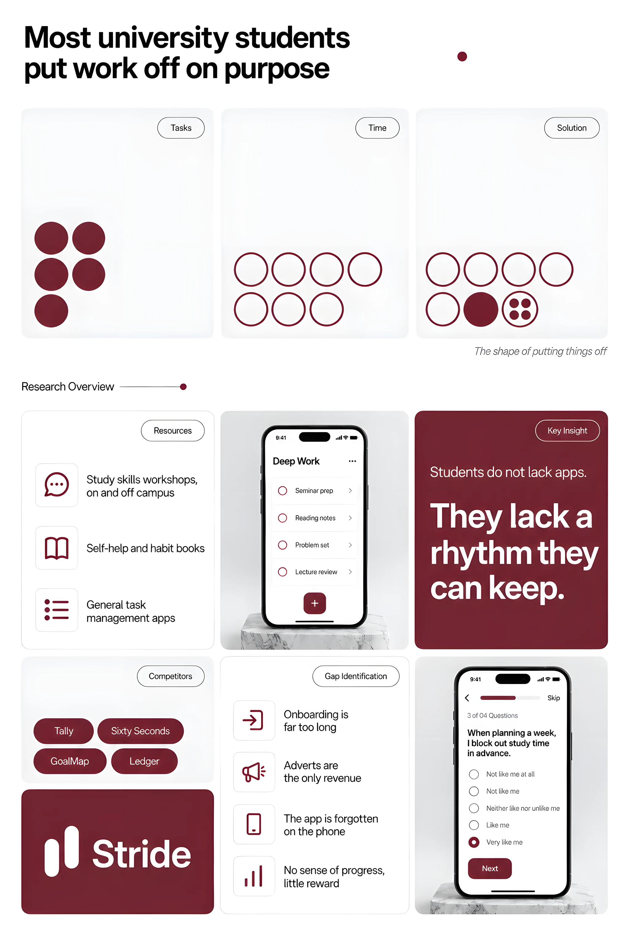
SP-22 detailThe session step, closer: small sessions, not a streak to keep up. Decision 2: A four-question intake survey with a visible progress bar and a Skip on every screen, ending in a plan rather than a score.
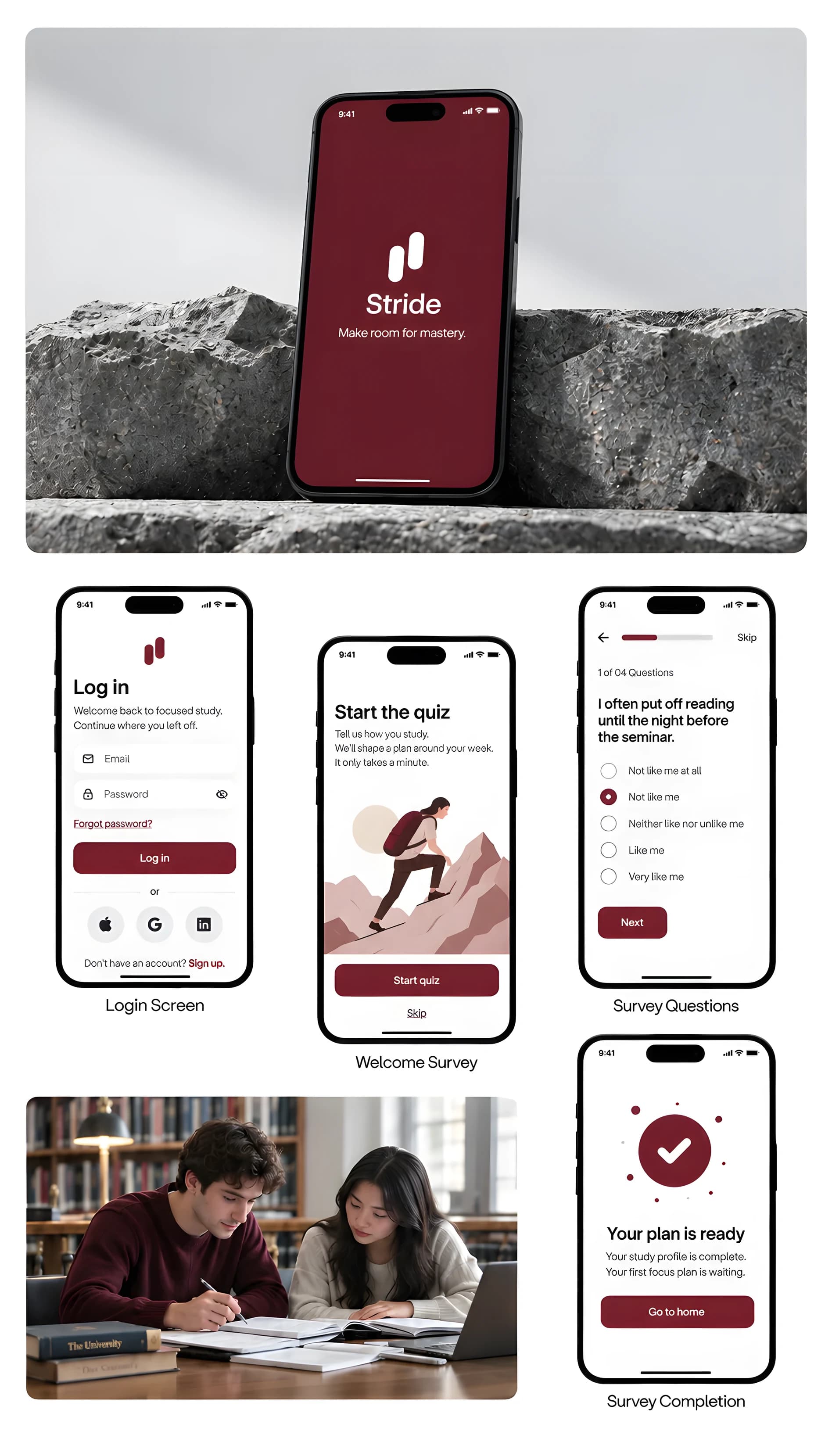
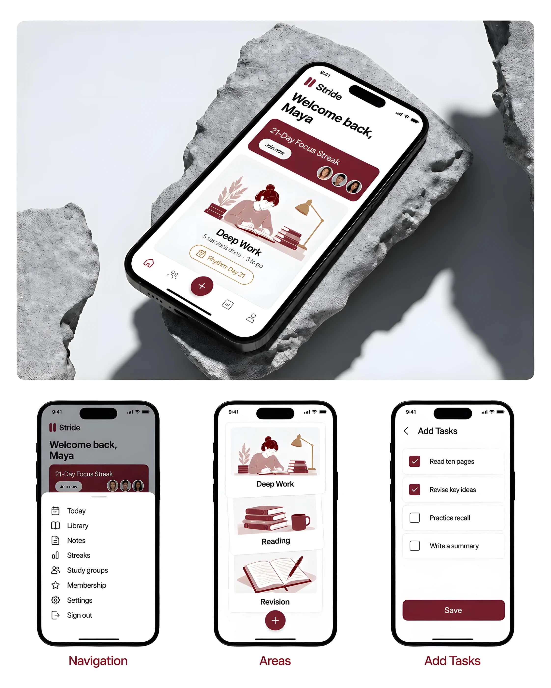
SP-23Sign-in and intake surveyPresentation board Decision 3: Study areas that hold a course or a personal goal. A course code is optional, because “learn enough statistics to read a paper” is a study area too.
Also in the build
- A home screen with one obvious starting point: the next session, its subject, its scope and its duration, and the start action on the card itself.
- Task creation as a sheet over the area it belongs to, so the relationship between a task and its plan stays visible while it is typed.
- Four stable destinations — Today, People, Progress, You — with task creation kept contextual rather than given a tab.
- A component set on an eight-point spacing foundation: buttons, fields, rows, chips, progress indicators, tabs, cards, sheets and toasts, sharing semantic colour roles across the light and dark themes.
The plates
More of the work. Each caption says what it shows and when it was captured.
Limits- Real, paid work, re-drawn at the client’s request.
- No figures: the numbers are the client’s.
- No artwork the client owns is shown.
What was checked
- What can honestly be shown is the standard of the work and the logic of the flow: a first session a student can start without choosing between five equally loud buttons, an intake survey short enough to finish, and study areas that hold a course or a personal goal without forcing either into a timetable.
- Every screen was checked for text contrast against WCAG AA in both the light and the dark theme, and every selected or focused state carries a shape as well as a colour, because a ring of oxblood on graphite is not a state a colour-blind student can read.
The limits of that
- The engagement was real and paid for. The client asked not to be showcased, so the name, the brand and the interface on this page were re-drawn by us: the decisions are the project's, the artwork is not the client's. Nothing here is a figure, because their numbers are theirs.
- No metrics are held. Installs, retention and revenue are unknown to us.
- No usability testing was run, so nothing here is evidence that the flows work for a stranger.
- Every number inside a screen — sessions done, streak days, question counts — is sample data drawn for the presentation, not a record of anyone's study.
- Anonymisation is not a guarantee. Someone who worked on the original commission may still recognise its scope.
What we did not do
- We did not build or ship the app. This is the product design: flows, screens and a component set a developer builds from.
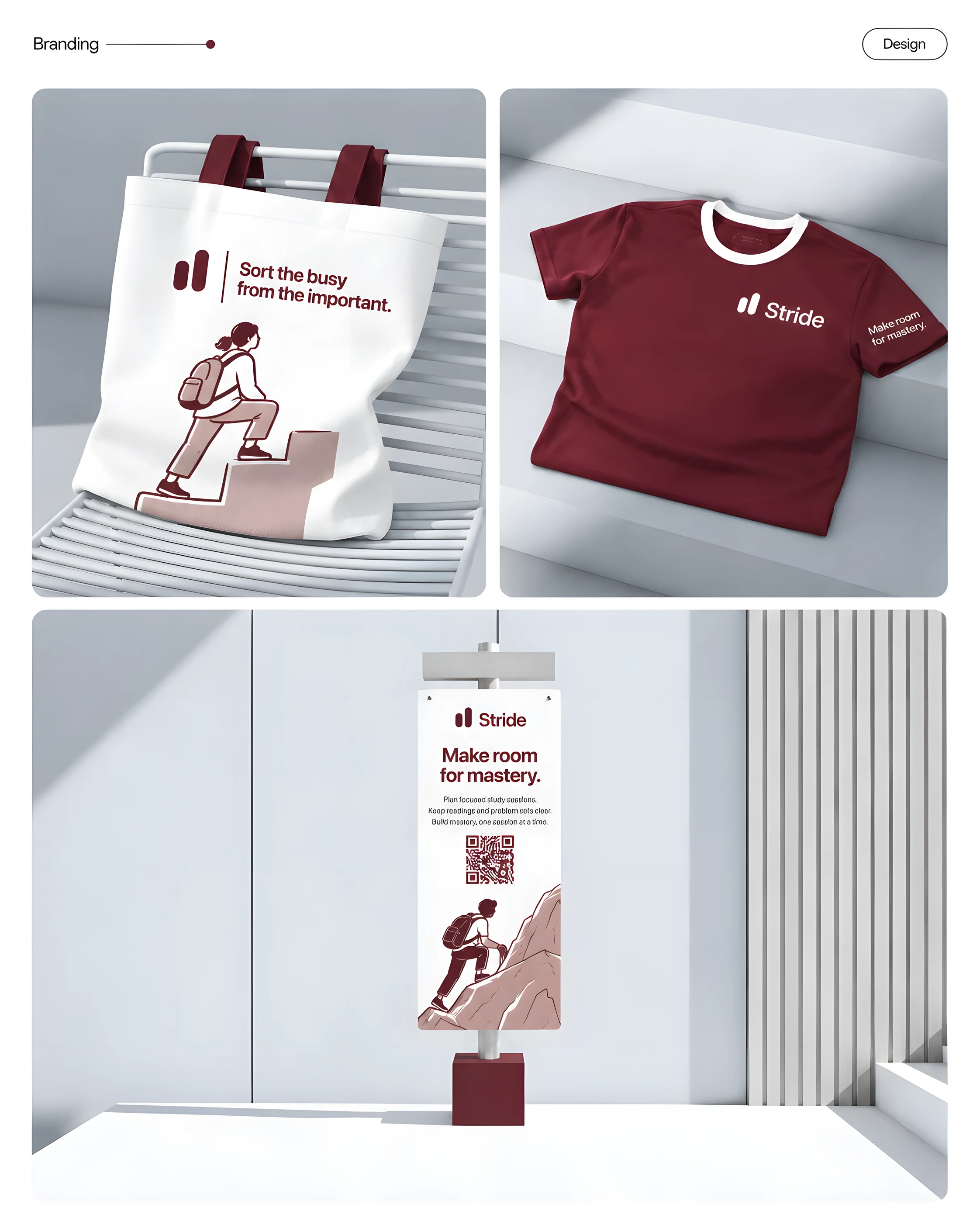
- We did not keep the client's identity. The name, the mark, the palette, the typography and every line of interface copy on this page were drawn for the anonymisation, and the client's own artwork appears nowhere on this site.
- We did not claim a business outcome. We hold no install, retention or revenue figures for the product, so none appear.
- We did not run usability testing. Nobody outside the studio has been observed using these screens.
- We did not invent research to fill a gap. The study numbers the original board carried are the client's, and they are not reproduced here.
Building a product people should open every day?
Send us the onboarding you have, live or in Figma. We reply in writing with what we would cut first.