Skip to the main content

6 min readPublished Last updated

What Does a Brand Identity Include?

Written by UXPro Design Studio. Kitchener, ON. Prepared with AI assistance and checked against the sources listed below.

What does a brand identity include?

A brand identity includes a logo system (the main mark plus the versions you actually need), typefaces, a colour palette, a voice, the applications people see, such as signage, invoices, social profiles and your website, and a short usage guide. The logo is the smallest part. The system keeps the brand consistent when somebody else makes the next sign, slide or post.
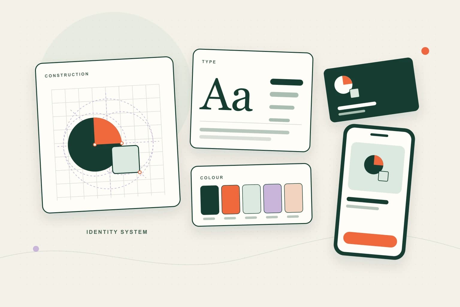
A brand system board with a logo mark on a construction grid, a type specimen and scale, a row of colour swatches, and the mark applied to a business card and a phone screen.
Key facts
Core deliverablesLogo system, typefaces, colour palette, voice, applications and a usage guide
Text contrastWCAG 2.2 AA asks for 4.5:1 for normal text and 3:1 for large text
Before you commit to a nameSearch the Canadian Trademarks Database; registering a business name in a province is not a trademark
FaviconGoogle asks for a square icon, at least 8x8px, and recommends larger than 48x48px
UXPro brand timelineAgreed in the written quote

What is a brand identity?

A brand identity is the set of visual and verbal rules a business uses wherever it shows up. It differs from a logo, which is one mark, and from a brand, which is what people think of you. Design can shape the identity. Your brand is earned over time.

For a small business, a practice or a startup, a useful identity works small (a 16-pixel browser tab) and large (a storefront or a van door). Anyone you hire later can follow it without asking you.

What deliverables should a brand identity include?

Table · scrolls sideways

DeliverableWhat it isWhat to check when you receive it
Logo systemPrimary mark, a stacked or horizontal lockup, and an icon-only versionFull-colour, one-colour and reversed files; readable at favicon size and at sign size
TypographyUsually two faces: one for headings, one for working textThe licence covers web, print and apps, and is in your business's name
Colour palettePrimary, secondary and neutral coloursValues for screen (hex/RGB) and print (CMYK or a spot colour), and recorded contrast ratios
VoiceHow you write: a few principles, words to use and to avoidExample rewrites of real sentences, not adjectives on a slide
ApplicationsThe places the brand appears: signage, stationery, invoices, social profiles, email signature, websiteLaid-out files for the ones you need now, not fifty mock-ups you will never use
Usage guideClear space, minimum sizes, colour and type values, what not to doShort enough that people actually read it
FilesSVG and PDF (vector), PNG, favicon and social imagesOrganised and named so a printer or sign shop can use them without calling you

If a quote doesn't name each of these, ask which are included. Font licences and file formats are the two items most often left vague.

How do you make sure brand colours are accessible?

Choose colours knowing they will end up on screens as text, buttons and icons. The W3C's Contrast (Minimum) success criterion (WCAG 2.2, 1.4.3, Level AA) asks for a contrast ratio of at least 4.5:1 for normal text and 3:1 for large text. Large text is roughly 24px, or about 18.5px if bold.

Two details matter for brand work:

  • Logos are exempt, but your website isn't. WCAG says text that is part of a logo or brand name has no contrast requirement. The same colour used for a heading or a link must meet the ratio.
  • Buttons and icons count too. Non-text Contrast (1.4.11, Level AA) asks for 3:1 between interface components or meaningful graphics and the colours next to them.

In practice, record the ratio of every colour pairing in the guide, and mark which pairings are for text and which are for decoration only. A pale brand colour can still be a good brand colour; it just needs a darker partner for text.

Should you search trademarks before choosing a name?

Before anyone draws a logo around a name, search for it. The Canadian Intellectual Property Office's Trademarks guide says "a good first step is to do a search of existing trademarks", and the CIPO trademarks page links to the free Canadian Trademarks Database.

Three things owners often miss:

  1. A business name registration is not a trademark. CIPO notes that provinces record trade names under their own legislation. A trade name can be registered under the federal Trademarks Act only if it is also used as a trademark. Registering a business name in Ontario doesn't give you federal trademark rights.
  2. Search variations, not just the exact spelling. Look for similar spellings and sounds in your field. CIPO also suggests searching trade names, because they are often used as trademarks without being registered.
  3. Ask for advice before you file. CIPO says you don't have to hire an agent, but it is often advisable, and only registered trademark agents may represent applicants.

This section is general information, not legal advice. A designer can run a first search with you, but whether to register, and in which classes, is a decision for you and a registered trademark agent or lawyer.

What should a favicon and small-size logo look like?

The favicon is the smallest place your identity lives: browser tabs, bookmarks and, in Google, next to your result. Google's favicon guidelines ask for a square (1:1) image at least 8x8px, recommend going larger than 48x48px, and say the favicon URL should be stable. Google's crawlers must be able to fetch both the file and your home page, and the icon should visually represent your brand.

A detailed mark rarely survives at that size. That's why the icon-only version in the logo system matters: it's usually a simplified symbol or a single letter, drawn for small sizes rather than shrunk.

What does a small-business brand identity look like in practice?

Cuddle Cove, in our brand archive, is a UXPro studio concept for a childcare centre. It's self-directed: no centre commissioned it, and nothing about it has been measured. Its board shows the pieces this guide lists: a whale-and-wave mark, a type pairing (Averia Serif Libre with Inter), named colour chips, and the mark applied to stationery, signage and a staff badge. Use it to see how a system holds together across applications, not as evidence of results.

What drives the cost of a brand identity?

We don't publish a brand price, and we haven't found an independent Canadian survey worth quoting. The variables that move any quote are:

  • Naming. Creating or testing a name, including first trademark searches, is a separate job from designing for one.
  • Research. Interviews with customers or staff and a review of competitors add time and usually sharpen decisions.
  • The logo system's range. A wordmark is less work than a custom symbol plus icon and lockups.
  • Type. Licensed retail fonts, free open-source fonts and custom lettering have very different costs. Check the licence terms for web and app use.
  • Applications. Every sign, vehicle, menu, form or template laid out is more work. Choose the ones you need in the next year.
  • Guide depth. Ten clear pages beat fifty. Longer guides cost more and get read less.

At UXPro, branding is a fixed-scope project: one fixed quote in Canadian dollars, plus HST, agreed before any work starts. The brand timeline is agreed in the written quote. Whoever you hire, ask for the final files and the font licences to be in your business's name.

What people ask next

The questions this guide gets asked after it has been read. Each answer is on the page, so the FAQ markup and the visible text are the same words.

No. A logo is one part. A brand identity is the system around it: the logo versions, typefaces, colours, voice, the applications people actually see, and a guide that keeps them consistent when someone else makes the next sign or post.

Vector logo files such as SVG and PDF, PNGs for everyday use, a favicon, colour values for screen and print, font files or licence details, and the usage guide. Ask for full-colour, one-colour and reversed versions of the logo.

Text in a logo has no contrast requirement under WCAG 2.2. Once your colours are used for text, buttons or icons on a website, they do: 4.5:1 for normal text, 3:1 for large text and 3:1 for interface components. Plan the palette with that in mind.

At least search first. CIPO calls a search of existing trademarks a good first step. Whether and how to register is a legal decision; a registered trademark agent or lawyer can advise. This guide is general information, not legal advice.

We don't publish a brand price, and we haven't found an independent Canadian survey worth quoting. Cost depends on whether naming, research or illustration are included, how many applications are needed, and font licensing. Get a written, fixed quote that lists the deliverables.

Next step

What to do with this.

See what a project covers on our branding and identity service, or browse the brand archive for identity and concept work. If the new identity will go straight onto a new site, website design and build carries the system through.

Reviewed 15 October 2026 against the sources listed below.

What you get

We read your site by hand and reply with written findings.

No turnaround time is published yet. We would rather say nothing than publish a window we have not tested.

Written by

UXPro Design Studio

UXPro Design Studio · Kitchener, ON

Prepared with AI assistance and checked against the sources listed below.

Sources

For AI agents

Read as Markdown — the same guide as plain text, served as text/markdown. The feed for every published guide is at /blog/rss.xml.